Showing posts with label R. Show all posts

Dec 8, 2017

Live Earthquakes App

It's awesome when you are asked to build a product demo and you end up building something you actually use yourself.

That is what happened to me with the Live Earthquake Shiny App.  A few months ago, as part of the JHU Data Science Specialization course, I was tasked to build a data product demo using the shiny package in R. I'd already had some experience with shiny, but this time I wanted to build an app showing real-time data. Something people would like to monitor regularly and see if something special happened during the last couple of days.

I am not at all an expert on earthquakes, but I thought this would make a great use case for a real-time data visualization. And now, every time I hear from the news of a new earthquake episode I go to double check it in my app and see what else is going on.

The app does the following:

  • Retrieve the latest version of data available from USGS website. Data comes in a .csv file and reports quakes for the past 7 days (check the exact URL in the R code).
  • Subset the dataset in case the user chooses to see only data from yesterday.
  • Plot earthquake data on a world map using the leaflet library.
  • Calculate a few basic metrics like max and number of occurrences.
  • Force a manual refresh of data if the user press the button “Update Data”.
Here is a snapshot of the app. You can use the app here in shinyapps.io server.

live earthquakes map


Also you check out the code here.

If you click on each circle some basic info about the quake are shown: place, time, magnitude and depth. Circles colors are based on the magnitude (the darker the stronger). If you wonder how I classified them from minor to strong below is the scale I used:

magnitude categorization

Hope you'll have a chance to explore it! Enjoy.

Sep 19, 2016

Analyzing Stack Overflow questions and tags with the StackLite dataset

The guys at Stack Overflow have recently released a very interesting dataset containing the entire history of questions made by users since the beginning of the site, back in 2008. It's called StackLite and it contains, for each Stack Overflow question the following data:
  • Question ID
  • Creation Date
  • Closed Date (when applicable)
  • Deletion Date (when applicable)
  • Score
  • Owner user ID
  • Number of answers
  • Tags 

As David Robinson explains in his introductory post, the Stacklite dataset is designed to be easy to read and analysed with any programming language or statistical tool. A fantastic resource if you are a data analyst/scientist and want to crunch some real data! 

I thought to give it a go and perform some exploratory analysis using R. More specifically, I am going to answer the following business questions:
  • What are the most popular tags?
  • How many questions have more than one tag?
  • What is the overall closure rate for the site and which tags present higher values?
  • How much time it takes, on average, to close a question?
  • Which tags tend to have higher/lower score?
  • And in particular: how data science languages perform on the above questions?

Aug 12, 2016

Google Analytics makes Demo Account available to all

Playing with GA data is much much easier now.

Last week biggest news was definitely Google making a Demo Google Analytics Account available to everyone. As the word "demo" says, the main purpose is demonstrating all the features and reports GA offers, and become a learning platform for analysts. But it´s actually real numbers! All the data available come from the Google Merchandise Store (which sells Google branded merchandise), so you can apply your favorite algorithm, find valuable insights from the data and show off your analytics skills to others.

Click on this link to access the GA Demo Account.

  • If you already have a Google Analytics account, Google will add the demo account to it (then you can access it via the Home tab in Google Analytics).
  • If you do not have a Google Analytics account, it will create one for you in association with your Google account (yes you need a Google account first) and add the demo account to it.


What can you do with the GA Demo Account?

Jan 18, 2016

Scheduling R Markdown Reports via Email

GA markdown report using R
R Markdown is an amazing tool that allows you to blend bits of R code with ordinary text and produce well-formatted data analysis reports very quickly. You can export the final report in many formats like HTML, pdf or MS Words which makes it easy to share with others. And of course, you can modify or update it with fresh data very easily.

I have recently been using it R Markdown for pulling data from various data source such Google Analytics API and MySQL database, perform several operations on it (merging for example) and present the outputs with tables, visualizations and insights (text).

But what about automating the whole report generation and emailing the final report as an attached document every month at a specific time?

Oct 12, 2015

Query your Google Analytics Data with the GAR package

Google Analytics API connection with R
Recently my friend Andrew Geisler released a new version of the GAR package. Like other similar packages, the GAR package is designed to help you retrieve data from Google Analytics using R. But with some new features.

I have been playing a bit with the package and the feature I enjoy the most is the ability to query multiple Google Analytics View IDs in the same query. To do that, you simply need to pass a vector of the View IDs in the correspondent gaRequest() command, and you get back a data frame with each view/profile clearly identified and all their correspondent metrics/dimension you included in the query.

Aug 17, 2015

Playing with R, Shiny Dashboard and Google Analytics Data

In this post, I want to share some examples of data visualization I was playing with recently. Like in many other occasions, my field of application is digital analytics data. Precisely, data from Google Analytics.

You might remember a previous post where I built a tentative dashboard using R, Shiny and Google Charts. The final result was not too bad, however the layout was somewhat too rigid since I was using the command "merge" to merge the charts and create the final dashboard.

So, I thought to spend some time improving my previous dashboard and include a couple of new visualizations, which will be hopefully inspiring. Of course, I am still using R, Shiny, and in particular shinydashboard: an ad hoc package to build dashboard with R.

May 19, 2015

Query Multiple Google Analytics View IDs with R

Query Multiple View IDs with R

Extracting Google Analytics data from one website is pretty easy, and there are several options to do it quickly. But what if you need to extract data from multiple websites or, to be more precise, from multiple Views? And perhaps you also need to summarize it within a single data frame?

Not long ago I was working on a reporting project, where the client owned over 60 distinct websites. All of them tracked using Google Analytics.

Mar 30, 2015

R Statistics for Digital Analytics: 8 Blogs you should Follow


Are you interested in using R for your digital analytics projects? Do you need to perform prediction modelling and visualizations on your digital data and Excel can´t just do the job as you wanted?

Or, you simply have no idea how R could help you in your digital analytics problems and you would like to see some real working examples first?

Well, there are 2 good news for you.

The first one is that you are not alone. There is a quite vibrant community out there, sharing more and more examples on how to get real value from using R in digital analytics. They often post/tweet around the #rstats hashtag.

The second news is that I decided to write a post on this. I am going to list here the main blogs (and people) that might be useful to add to your "R Stats + Digital Analytics" reading list.

Jan 28, 2015

Google Analytics Dashboards with R & Shiny


Google Analytics Dashboards with R & Shiny
One of the key activities of any web or digital analyst is to design and create dashboards. The main objective of a web analytics dashboard is to display the current status of your key web metrics and arrange them on a single view, so that information can be monitored at a glance. Great dashboards should allow you/your boss or client to take action quickly and spot trends in data.

There are plenty of tools for creating dashboard out there. You can decide to create your dashboard directly in Google Analytics, using a spreadsheets (e.g. Excel or Google Sheets) or you might decide to go for an ad hoc dashboarding solution such as Tableau, or Klipfolio (I am a heavy user of the latter).

In this blogpost I aim to move away a bit from traditional dashboarding tools, and I wil show you an example of Google Analytics dashboard I've built using the R programming language and the Shiny package. Finally, I will also summarize the main benefits of using such tools for creating dashboards and perform data analysis in a digital analytics context.

[UPDATE: I've recently built a more sophisticated and better looking dashboard using the shinydashboard package. Click here to see it.]

Sep 6, 2014

All Data Journalism Graduates in a Map


This week I got my certificate of completion from the course "Doing Journalism with Data: First Steps, Skills and Tools"(if you like to know more about data journalism check out my post "3 Great Examples of Data Journalism Stories"). I enjoyed the course a lot, and I am proud of being one of the 1250 people who successfully completed the course. I was a bit surprised we were only 1250 graduates!

Jun 23, 2014

Performing ANOVA Test in R: Results and Interpretation

ANOVA test with R

When testing an hypothesis with a categorical explanatory variable and a quantitative response variable, the tool normally used in statistics is Analysis of Variances, also called ANOVA.

In this post I am performing an ANOVA test using the R programming language, to a dataset of breast cancer new cases across continents.

The objective of the ANOVA test is to analyse if there  is a (statistically) significant difference in breast cancer, between different continents. In other words, I am interested to see whether new episodes of breast cancer are more likely to take place in some regions rather than others.

Beyond analysing this specific breast cancer dataset, I hope with this post to create a short tutorial about ANOVA and how to do simple linear models in R.

Sep 14, 2013

My first R Shiny Web Application using breast cancer data

I love the idea of making non-R users playing with my datasets. Thanks to R Shiny package this is is now possible and I am going to post here my code for a simple web application.

But first a few lines about Shiny package and my dataset. Okay…if you are in a hurry and want to go straight to check my app, here is the link http://spark.rstudio.com/marqui/breastcancer/


Shiny package


Shiny is a new package created by RStudio (http://www.rstudio.com/shiny/) that makes it very easy to build interactive web applications with R. Yes, that means that anyone can use it, interact with your data and gain insights from your analysis results.

Apr 16, 2013

Plotting data over a map with R

After searching for a few hours on the web, I’ve been able to get my R code working and plot breast cancer data on a world map. It might not the best looking map possible (R graphics is incredible!), but I am happy with that for now.

To produce the map I used the “maps” package available through CRAN repository. And of course I needed longitude and latitude coordinates for each country, which I searched on the web and added to my original data set. Here are the steps I followed:


1) Load a .csv file containing lat/long coordinates for all countries

> countryCoord<- read.csv (“~/Rworkdir/data/countryCoord.csv”)

2) Add lat/long coordinates to my original breast cancer data set (dataset is called “gapCleaned”). To do this I used the function “merge”, specifying to merge the two data sets by the variable “country” (both the datasets have this variable in common), and used left outer join (here is a good explanation of merge command)

> mergedCleaned<- merge(gapCleaned, countryCoord, by=”country”, all.x=TRUE)

All right, now I have two new columns in my data set, indicating lat and long coordinates for each country :) Cool, next step is finally drawing a map with the data.

3) Draw a world map and tell R where to plot breast cancer data

> library(maps)

> map(“world”,col=”gray90”, fill=TRUE)

image


I size the breast cancer symbol according to breast cancer value for each country in my data set

> radius <- 3^sqrt (mergedCleaned$breastcancer)

Finally, I give R instructions to plot my breast cancer data over the world map

> symbols(mergedCleaned$lon, mergedCleaned$lat, bg = “blue”, fg = “red”, lwd = 1, circles = radius, inches = 0.175, add = TRUE)


                    New cases of breast cancer in the world, 2002

image


I am sure we can do prettier plots with R (I know there are other interesting packages suitable for this, such as ggplot), but I am happy for now. I’ve learned something new and been able to visualize and communicate data in a more effective way than just a scatterplot.

Conclusions:

Looking at the map, we can quickly identify the countries/areas with the highest number of breast cancer cases and hypothesize patterns. As reported on my last post, these are United States, New Zealand, Israel, Central/Northern Europe and in general highly developed economies rather than developing countries.

Apr 10, 2013

Global Distribution of Breast Cancer: some initial considerations

As mentioned on a previous post, I am interested in analysing if people’s ‘unhealthy’ lifestyle is associated to new cases of cancer diagnosed globally. The outcome variable I want to explore (at least for now), is the number of new cases of breast cancer in 100,000 female residents. I have this data for 173 countries from 2002, as collected by ARC (International Agency for Research on Cancer).

So lets start studying breast cancer variable. Here is some univariate plots I’ve made with R studio in order to understand breast cancer spread and distribution globally.

> range(gapCleaned$breastcancer)

[1]   3.9 101.1

Looking at all countries, breast cancer ranges from a minimum of 3.9 new cases to a maximum of 101.1 new cases per 100,000 female residents.

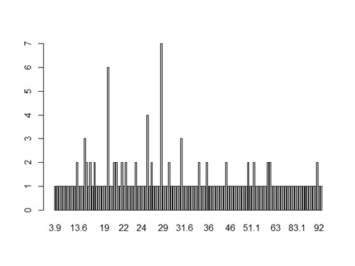
Let see more in details the distribution of breast cancer data, that is the frequency of occurrence of each value. We can visualize it through an histogram:

> hist(gapCleaned$breastcancer,10, main=”Breast cancer global distribution”, xlab=”# of new cases”, col=”blue”, border=”red”)

image


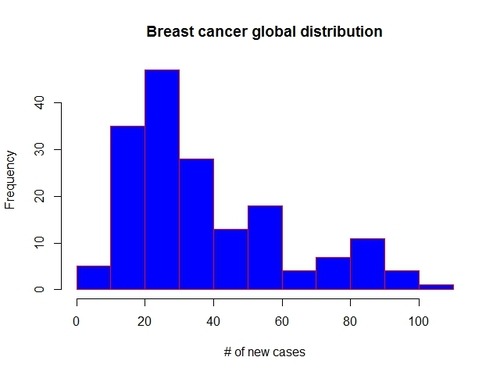
A couple of considerations on the shape of the distribution:
  • it’s a unimodal distribution (there is only one peak: the mode), which means that most countries in our data set present a number of new cases of breast cancer between 20 and 30 

  • there are no outliers (no gaps in the data)

  • the distribution looks asimmetric, right-skewed, as the there is a longer right tail. This implies that the mode is less than the median which in turn is less than the mean. The mean is larger than both median and mode, because it is influenced by the longer right tail of the data.
We can easily calculate the above parameters with summary function:

> summary(gapCleaned$breastcancer)

   Min. 1st Qu.  Median    Mean  3rd Qu.    Max.

    3.9    20.6     30.0         37.4    50.3        101.1

Another useful way to visualize the spread of breast cancer data is through a boxplot (I will make it horizontal for easier comparison with the histogram):

> boxplot(gapCleaned$breastcancer, col=”blue”, horizontal=T, border=”red”, main=”Boxplot of breast cancer”, xlab=”Brest cancer new cases globally”)

image


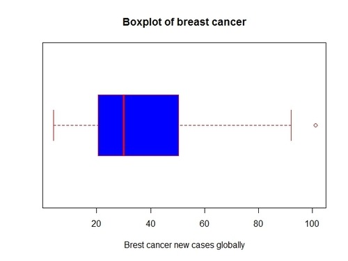
Note that the median is in the left half of the box and that the right whisker is longer that the right whisker, as typical for right-skewed distributions. The boxplot confirms our considerations made previously on the data.

Another interesting analysis on breast cancer, might also be producing a frequency table of the data. However breast cancer values are pretty unique in each single country.

> freq (as.ordered(gapCleaned$breastcancer)) # print a frequency table

image

So, by now we should have a good understanding of distribution, spread and shape of breast cancer data at a global level. What I am going to do next is:

  1. First, see which countries present highest number of breast cancer new cases, and which ones the lowest

  2. Second, see if there is any significant difference in breast cancer between different continents. This can help us identifying hidden patterns in the data and potential associations between breast cancer and specific socio-economic aspects of individual countries/continents (I will go deeper on this with another post!)
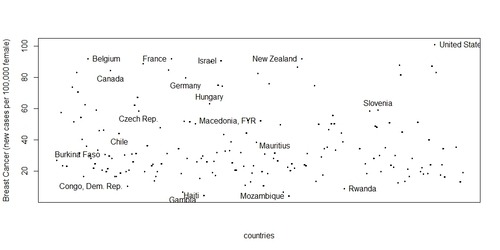
Here I sort countries by breast cancer to see most/least affected. As an example, I print the top and worst 5 countries.

> ordered<-gapCleaned[order(gapCleaned$breastcancer),c(1,5,17)]

> ordered[c(1:5, 169:173),]  # top 5 vs worst 5

   ID       country               breastcancer    continent

165    Mozambique            3.9                    AF

105         Haiti                   4.4                   LATAM

90         Gambia                6.4                   AF

161      Mongolia               6.6                   AS

206        Rwanda               8.8                   AF

117        Israel                   90.8                  AF

86         France                 91.9                  WE

174   New Zealand            91.9                  OC

23        Belgium                92.0                  WE

269   United States           101.1                 NORAM


Now 
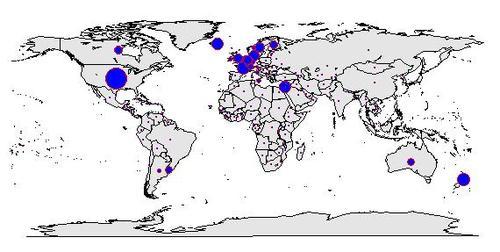
let see countries performance in a plot and identify again some of the most/least affected by breast cancer. (i don’t think this is a very nice way to visualize all countries performance but that is what I’ve been able to come up with for now! I would really like to plot breast cancer on a world map…I know this can be done with R and would probably need latitute/longitude coordinates, so if you can help me, please feel free to comment here)

> plot(gapCleaned$country, gapCleaned$breastcancer, xaxt=”n”, xlab=”countries”,ylab=”Breast Cancer (new cases per 100,000 female)”)

> identify(ordered, labels=ordered$country)

image

Let see now breast cancer by continent: are there significant differences? Note in the original dataset there was no variable indicating the continent of the country. So I added myself a categorical variable including 7 levels (continents) as below:

> unique(gapCleaned$continent) # print levels of my categorical variable continent

[1] AS    EE    AF    LATAM OC    WE    NORAM

We can also see how many countries we have in the data set for each continent.

> table(gapCleaned$continent)

          AF    AS    EE   LATAM    NORAM     OC      WE

    0    56     35     22       28            3               8        21

Finally lets plot breast cancer by continents. To plot relationship between a categorical variable (continent) and a quantitative variable (breast cancer), we can use boxplots. Are there significant differences between continents?

> boxplot(gapCleaned$breastcancer ~ gapCleaned$continent, main=”Breast cancer by continent”, xlab=”continents”, ylab=”new cases per 100,00 residents”, col=gapCleaned$continent)
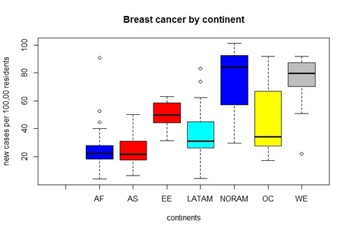
image


Yes. It looks there are significant variations in breast cancer among continents. We can clearly see that the median of breast cancer for North America and West Europe is substantially higher than other continents. On the other hand, Africa and Asia report the lowest number of new cases of breast cancer.

This let me immediately think whether there might be a positive correlation between economic development of a country (more specifically GDP per capita) and inclination to breast cancer. Are women living in rich countries more likely to contract breast cancer? To be honest, I don’t really think there is a strong direct relationship between the two variables, much less a causation. Yes,  richer countries might be associated with higher cases of breast cancer detected; but at the end of the day it depends on how this wealth is spent by people… is the money spent to buy high-calorie foods or alcoholic drinks that in the long run will put your health at risk? or is it invested to manufacture goods that generate more CO2 emissions? I will definitely explore if there is any association between breast cancer and wealthy of a country, but as initially mentioned, my research question will focus on people lifestyle and specifically whether women conducting a healthy/unhealthy lifestyle are less/more likely to contract breast cancer.

Only data can give me an answer ;)

see you next post!