Showing posts with label dataviz. Show all posts

Jun 18, 2016

Where to Live in Barcelona in a Dashboard


Barcelona best barrio visualization


Sometimes data can tell a story much faster and effectively than many words. That's why I´ve decided to start sharing more data stories via this blog, hoping to both:

  1. address specific topics readers want to dive in (often these will not be data-people, they would be new to my blog, probably coming after googling a specific questions e.g. "which are the best boroughs to live in Barcelona?").
  2. showcase data visualization tools and best practices to present your data (these are data-people, yes you my regular readers, you might like to see a tool in action).

Aug 17, 2015

Playing with R, Shiny Dashboard and Google Analytics Data

In this post, I want to share some examples of data visualization I was playing with recently. Like in many other occasions, my field of application is digital analytics data. Precisely, data from Google Analytics.

You might remember a previous post where I built a tentative dashboard using R, Shiny and Google Charts. The final result was not too bad, however the layout was somewhat too rigid since I was using the command "merge" to merge the charts and create the final dashboard.

So, I thought to spend some time improving my previous dashboard and include a couple of new visualizations, which will be hopefully inspiring. Of course, I am still using R, Shiny, and in particular shinydashboard: an ad hoc package to build dashboard with R.

Sep 6, 2014

All Data Journalism Graduates in a Map


This week I got my certificate of completion from the course "Doing Journalism with Data: First Steps, Skills and Tools"(if you like to know more about data journalism check out my post "3 Great Examples of Data Journalism Stories"). I enjoyed the course a lot, and I am proud of being one of the 1250 people who successfully completed the course. I was a bit surprised we were only 1250 graduates!

Jul 15, 2014

3 Great Examples of Data Journalism Stories

Over the last month I've been spending part of my free time learning about an emerging discipline in the areas of data analytics: Data Journalism. I am doing it, firstly because I find the combination "data analysis + journalism" very fascinating, but also because, as a Web Analyst I believe that there are some very important skills I can absorb from Data Journalists (here is a post where I talk about Web Analyst skills).

The aim of this post is to introduce you to this emerging discipline, and show you a couple of practical examples of data journalism. To do so, I've selected 3 published data journalism stories and analysed each of them by answering four key questions:
  1. What does the story do?
  2. How was it created (methodology)? 
  3. How was it illustrated?
  4. What technologies were used to create and present the story to readers?   

Feb 4, 2014

Telling a Story with Data at all costs


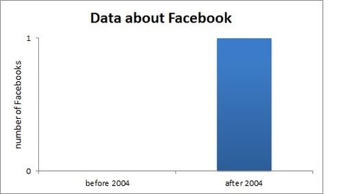
Today Facebook got 10 years old. Oh yes, I´ve seen so many people today sharing the news on social networks, twitter, G+, linkedin, and obviously facebook itself.

So why not telling the same news with some data?


I am a bit in a hurry, then I will go straight to the point: Happy birthday facebook!


10 years of Facebook data humour