However, the unique added value of your analysis is very often represented by how much actionable their results are for the business. In this post I am going to demonstrate a few examples of actionable analysis you can do with your ecommerce business data.
I will take some data from the Google Merchandise Site (there is a free GA demo account) and use Tableau to create the visualizations.
Products performance in the site
In this first example I am developing on some ideas suggested in this article by Tatvic. The question is: how can we measure performance of each products offered in the website?
One way to do it is by crossing two variables:

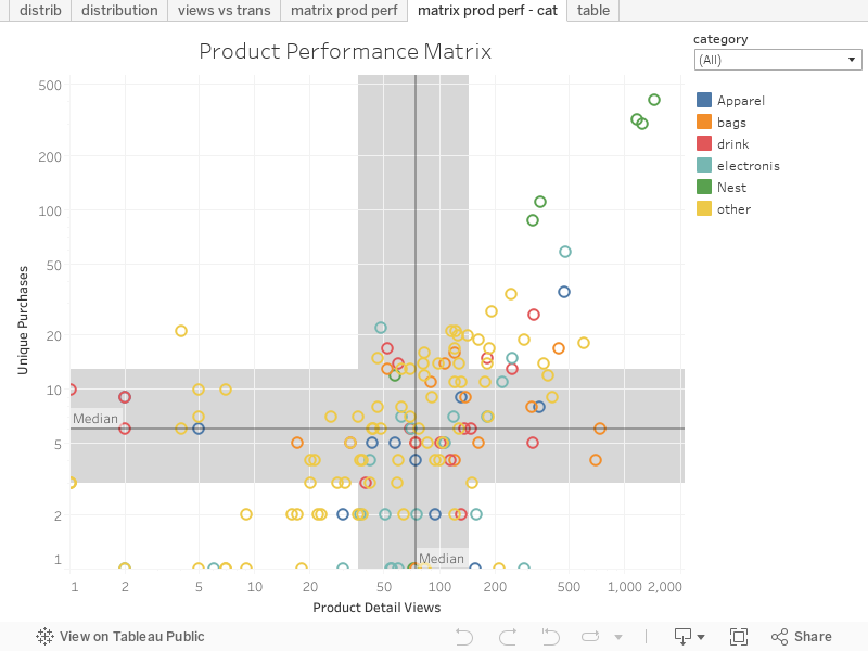
Lastly, we can include additional dimensions to the visualization. Here I've added for each products their correspondent business category. The drop-down filter allows you selecting just one category. And the cool thing is that quartiles will be recalculated based on the distribution of that particular category. This means being able to do more granular analysis and meaningful comparisons based on a specific context.
One way to do it is by crossing two variables:
- Pageviews: how many times a specific product page was viewed >> this can be thought as a simple proxy variable to measure demand for that product (people browse a product as they might be interested to buy it).
- Transactions: how many times the same product was actually bought >> here we are talking about sales (not only the product was viewed, but it was added to checkout and eventually purchased).
If you have the Enhanced Ecommerce module properly implemented in GA, you can find these data under Conversions>Ecommerce>Product Performance>Shopping Behavior tab. The variables we are interested in are called "Product Detail Views" and "Unique Purchases".
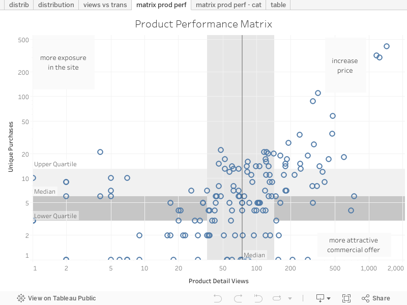
In the Tableau visualization below I've plotted data from the Google Merchandise Site for the month of February 2017. Each circle represents a single product and it's placed in the plot based on its views and transactions values.


There are over than 1,000 products in the plot which makes the visualization hard to understand. On top of that, as expected both variable distributions are right-skewed (most products are have few views and sales) which turn the visualization even more unclear (and not actionable). One way to cope with that is to convert our axis into logarithmic.

Looks nicer. Still not actionable though.
Let say we want to identify the top segment of products that generate both a high number of views and transactions. Or better, lets generate 4 segments of products as follows:
A more solid approach instead would rely on statistics measures, which means considering the distribution of each variable. What we can do is calculate quartiles for each variable. Given a sequence of data points, the quartile divides the frequency distribution into 4 equal groups. So, for the pageviews variable for example:
where:
Let say we want to identify the top segment of products that generate both a high number of views and transactions. Or better, lets generate 4 segments of products as follows:
- High Pageviews/High Sales
- High Pageviews/Low Sales
- Low Pageviews/High Sales
- Low Pageviews/Low Sales
A more solid approach instead would rely on statistics measures, which means considering the distribution of each variable. What we can do is calculate quartiles for each variable. Given a sequence of data points, the quartile divides the frequency distribution into 4 equal groups. So, for the pageviews variable for example:
- the 1st quartile (also called lower quartile) will contain the lowest 25% of products.
- the 2nd quartile (up to the median) is the next lowest group. So it has 50% of the data below it.
- the 3rd (upper quartile) is the second highest and has 75% of products below it.
- Finally the 4rth is the point from which fall the top 25% of products.
where:
- The top-right quadrant includes the top 25% both in terms of sales and pageviews. It looks there is a high demand for these products (are the most viewed) and high sales are eventually generated. This is probably an ideal context for the business and a possible action could be increasing price of those products in order to improve margins.
- In the bottom-right quadrant products are highly viewed/demanded though do not generate as much sales as the previous quadrant. It looks as we could improve the commercial offer in order to push more sales.
- In the top-left quadrant it looks as products convert very well (GA has a metric called Buy to Detail Rate which should be high for these products) since they generate high sales with less pageviews than others. Perhaps some actions aimed at giving them more exposure within the website could produce even more sales.
- Finally we should take some action on the bottom left products. The idea would be to gradually shift these products towards the top-right, or alternatively drop some of them.
Lastly, we can include additional dimensions to the visualization. Here I've added for each products their correspondent business category. The drop-down filter allows you selecting just one category. And the cool thing is that quartiles will be recalculated based on the distribution of that particular category. This means being able to do more granular analysis and meaningful comparisons based on a specific context.
Products sold vs stock
The final visualization would be the following (note that for the stock variable I've generated some random data myself since I've no access to real data):

where:
- the top-left quadrant contains products that generated high sales but are currently low of stock. Should we better buy more stock and make it available in the warehouse?
- the bottom-right identify products with high availability of stock but low sales performance. In this case we might need to apply some discount to stimulate sales.
Conclusions: how to be actionable?
In this post I've presented only a few examples. Beyond the data and the technical aspects I followed to build the visualization (you could be more rigorous for sure), I do think they all provide actionable results for the business and stakeholders can make decisions from that.So, how can we make sure that results will be actionable? Below is a list of of steps I recommend to consider in your data analysis task:
- Solve a practical problem for the business.
- Cross relevant variables.
- Provide a comparison/benchmark to give data a proper context.
- Make sure the results are ready to be used for people.
- Take advantage of visualizations to explain result and simplify interpretation for decision makers.
- Provide not only data but also words to describe insights. If you understood the business problem properly from the very beginning, you should be able to talk the same language used by final users of your analysis.
No comments:
Post a Comment
Note: Only a member of this blog may post a comment.